If you are looking for a way to get the iOS Control Center on your Android smartphone, here goes the best solution.
Mi Control Center App for Android
Mi Control Center is an app inspired by the design elements and iOS Control Center icon arrangements. MIUI has been known for being heavily inspired by iOS design choices. Over the last couple of years though MIUI has carved out its own look and feel. It is, however, still more iOS than Android, from the design and transition aspects. MIUI 12, the new version of this Android skin brings another iOS inspired feature called the Control Center, with the new app called Mi Control Center. Just like on iOS, MIUI is separating the notifications shade and the Quick Settings. This new design can be tempting to try, especially the Control Center part of it.
Get iOS Control Center on Android Using Mi Control Center
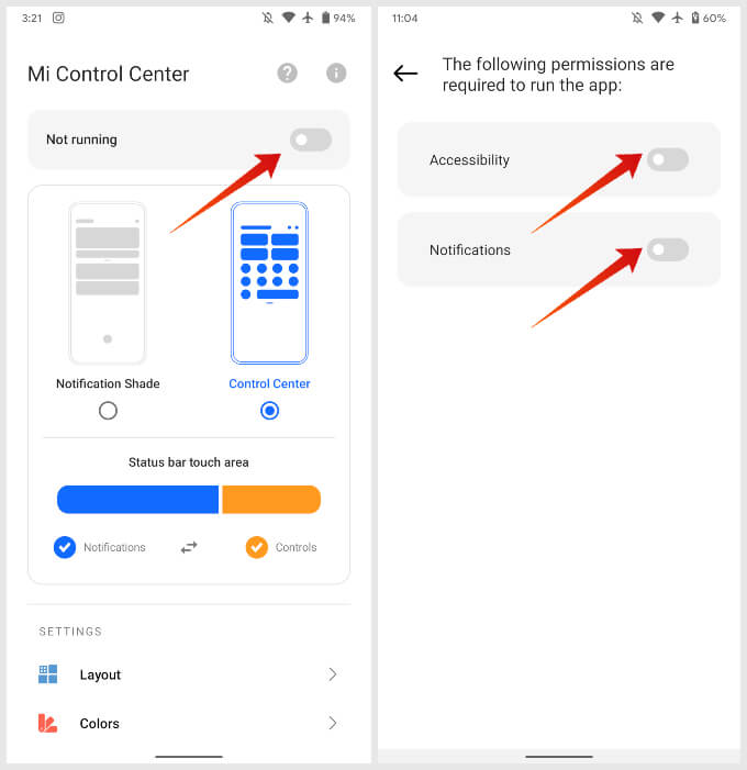
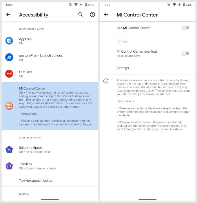
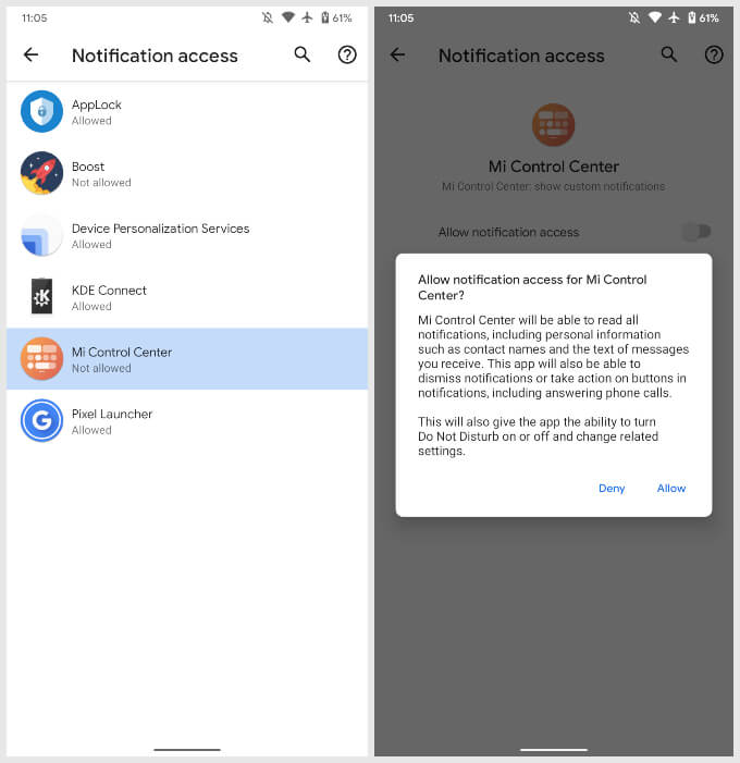
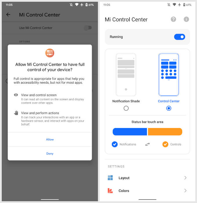
The Mi Control Center app allows you to get an iOS-like Control Center on any Android smartphone. The app name does not matter at all, it works on any Android smartphone. You do not need to have a Mi smartphone to run Mi Control Center app. Follow the steps to know how to install and use the control center on your Android smartphone.
After enabling the Mi Control Center app on your Android smartphone, you can start using the iOS Control Center on Android smartphones as below. Also Read: How to Send Large Files from iPhone to Android/PC
Using an iOS Style Control Center On Android
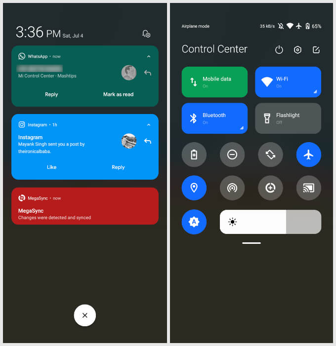
With the Mi Control Center app up and running you can now have a hands-on experience with Control Center on Android. By default, Mi Control Center is configured to behave like on iOS. So if you swipe down from the left of the top edge of the screen you get the notifications shade. If you swipe down on the right of the top edge you get your quick settings instead. This can be tweaked in the app.
The app’s animations are smooth and very iOS-like. It’s still the Mi Control Center though so it does not copy the iOS aesthetics exactly the same. In the app, you can configure some things which make this more customizable than the iOS Control Center or even the actual MIUI Control Center.
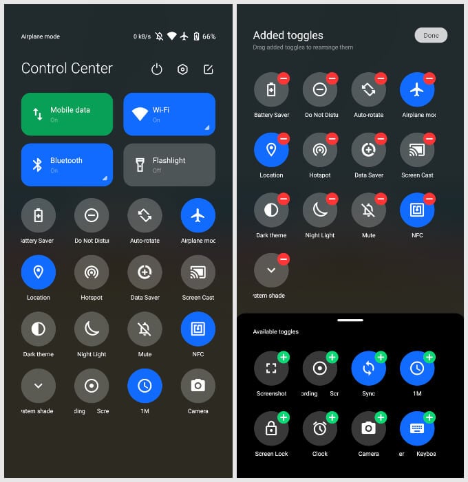
Tapping the edit icon in the top-right corner of the control center lets you add or remove quick settings icons. It is similar to the iOS Control Center on the iPhone or iPad, as you can select the icons to appear in the window. There’s even a quick setting tile to let you open the default system notification shade, in case you need to. The iPhone also has plenty of other features that are not there on Android by default. Don’t forget to check our note features that you’ll be missing on your Android, compared to iPhone. While it looks good, I think notifications are one area where Android reigns supreme. That’s true for how Android displays notifications too. With Android’s default notification shade, one can still see the background activity. The background blur takes you completely off what you were doing and feels a bit more distracting. That’s not an opinion everybody will share though. Today, Android and iOS both have come a long way since their first versions. Google has added a lot of finish and polish to the platform. Apple, on the other hand, has added plenty of features. The two mobile operating systems still look very different. Apple uses a lot of transparency and blur while Google prefers opacity. It’s very possible that you may prefer what Android lets you do, but prefer the design aesthetics of iOS. In such cases, you can still stay with the freedom that Android provides while using the unique iOS features with apps like Mi Control Center.
Δ


